‘Ten Days on the Island’ is Tasmania’s only state-wide international arts festival, celebrating creativity, storytelling and the island’s distinctive cultural identity. As the Festival evolved, it needed a visual identity that could stand confidently on a national and international stage while remaining deeply connected to place.
Previous expressions of Tasmanian identity often leaned on familiar symbols such as the Tiger or colonial references. While recognisable, these had become overused and limiting. The Festival required a new way to express Tasmania. Something that felt unmistakably local without relying on cliché, and capable of engaging both Tasmanian audiences and visitors from beyond the island.
Futago was commissioned to develop a new identity that could hold this balance. It needed to feel vibrant and contemporary, while still grounded in the nuances of the island. The challenge was not just to be seen, but to be remembered.
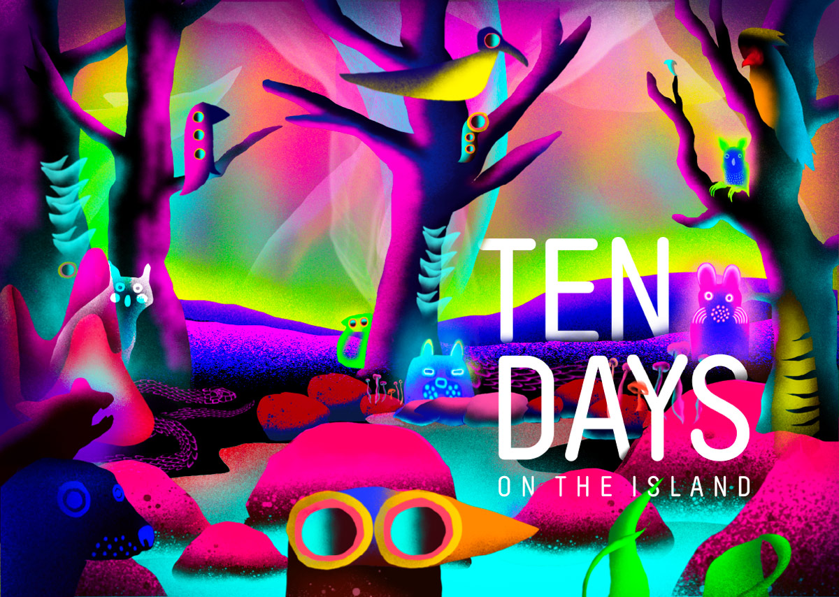
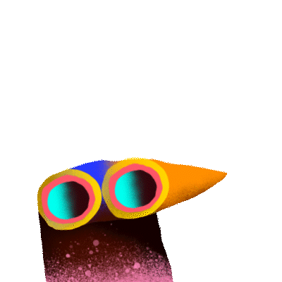
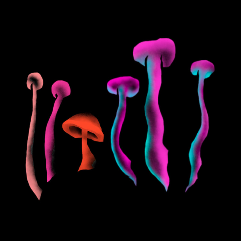
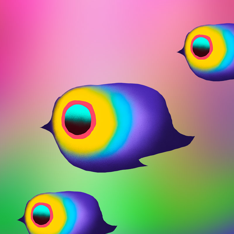
The concept drew from Tasmania’s lesser-known natural phenomena. Bioluminescent shorelines, fluorescent wildlife and the shifting presence of the Aurora Australis revealed a version of the island that is unexpected, luminous and full of energy. This became the foundation for a visual language that celebrates what is often hidden or overlooked.
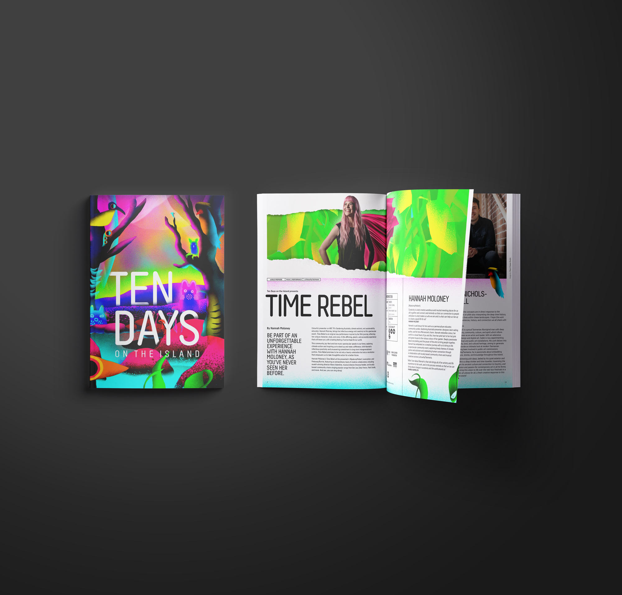
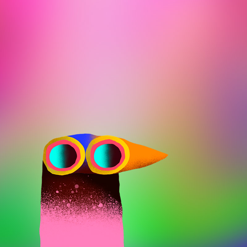
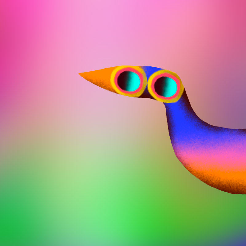
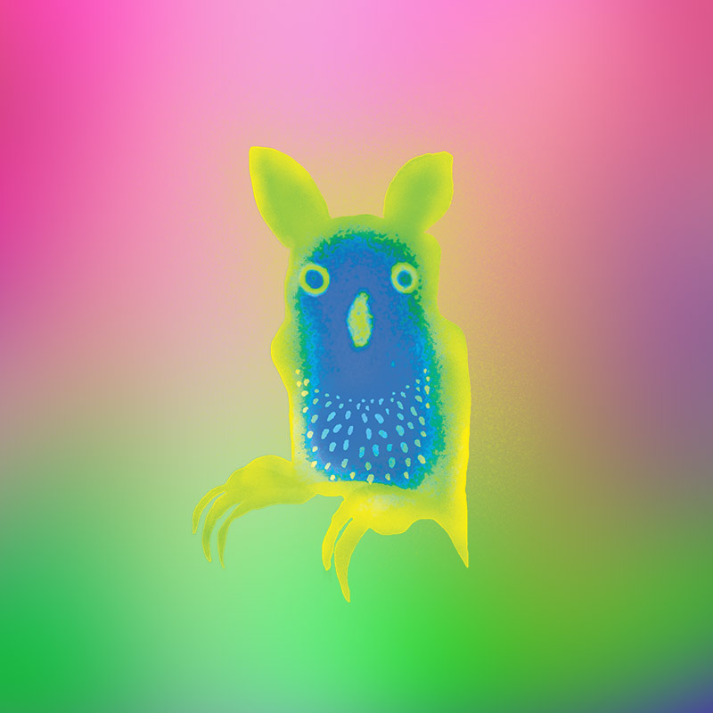
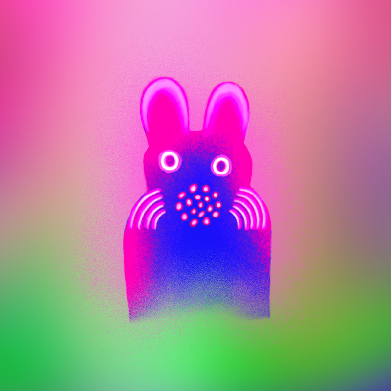
Working closely with the Artistic Director and Festival team, an in-house illustrator developed a distinctive body of work that became central to the identity. The process was collaborative and intuitive, allowing ideas to evolve through conversation. The result is an identity that feels alive and embedded in the spirit of the Festival.
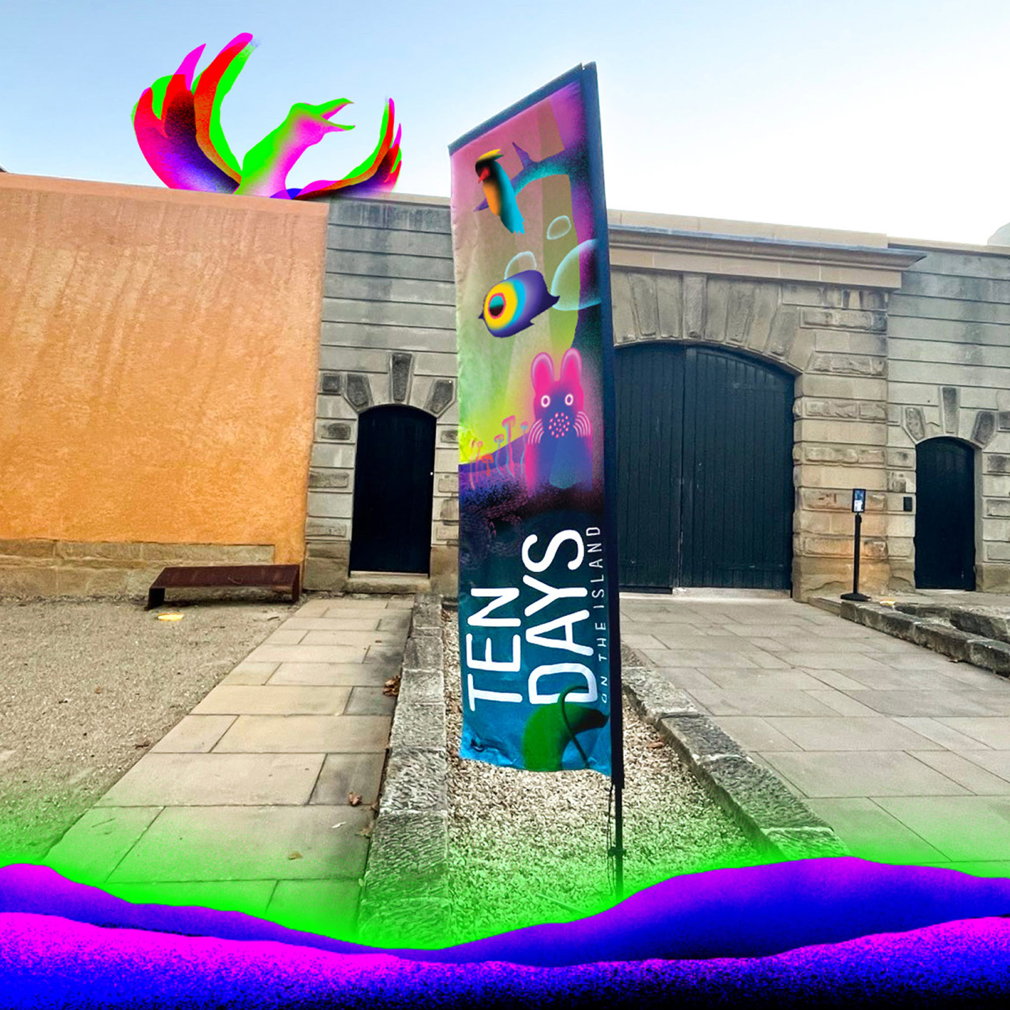
The system builds momentum over time. Early expressions are soft and anticipatory, gradually layering colour, texture and complexity as the Festival approaches. By launch, the identity reaches full intensity. Bold, luminous and impossible to ignore.
Illustrated Tasmanian characters introduce a sense of play and discovery, while contemporary typography provides clarity and accessibility. The balance allows the identity to move between wonder and legibility with ease.
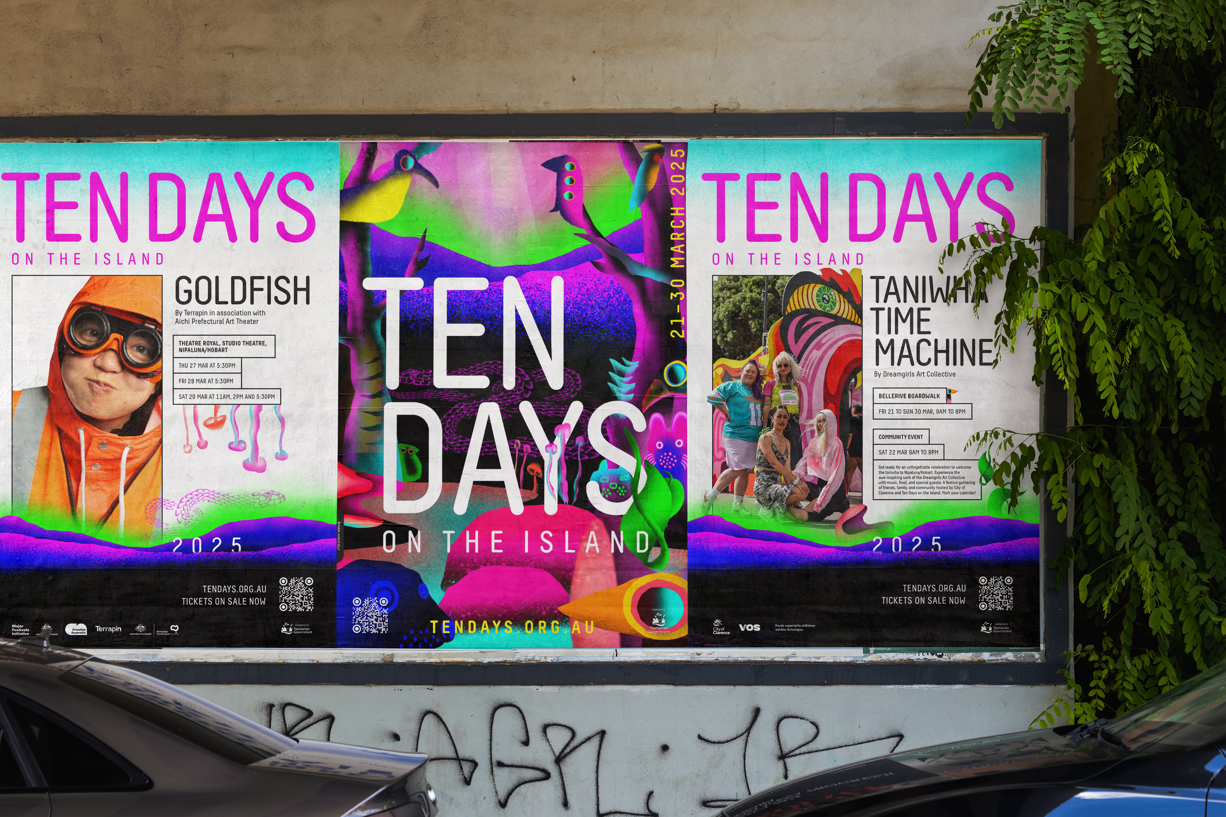
Production played a key role. Fluorescent inks were used in print to amplify colour beyond standard processes, while digital applications pushed RGB to its limits to achieve maximum vibrancy across screen-based platforms.
The new identity has expanded the Festival’s presence and reach. It has helped attract new audiences while re-engaging long-time supporters, with increased visibility across print, digital and social channels.
More than a visual update, the work reframes how Tasmania can be seen and experienced. It presents the island as curious, surprising and full of energy, inviting audiences to look closer and discover something unexpected.