Service Tasmania is the human face of Tasmanian Government, a network of 27 service centres reaching communities across the state, from Hobart to Triabunna. Futago worked with the DPAC Communications team and Service Tasmania to create an evolved identity that sits confidently as the 'front door' of government.
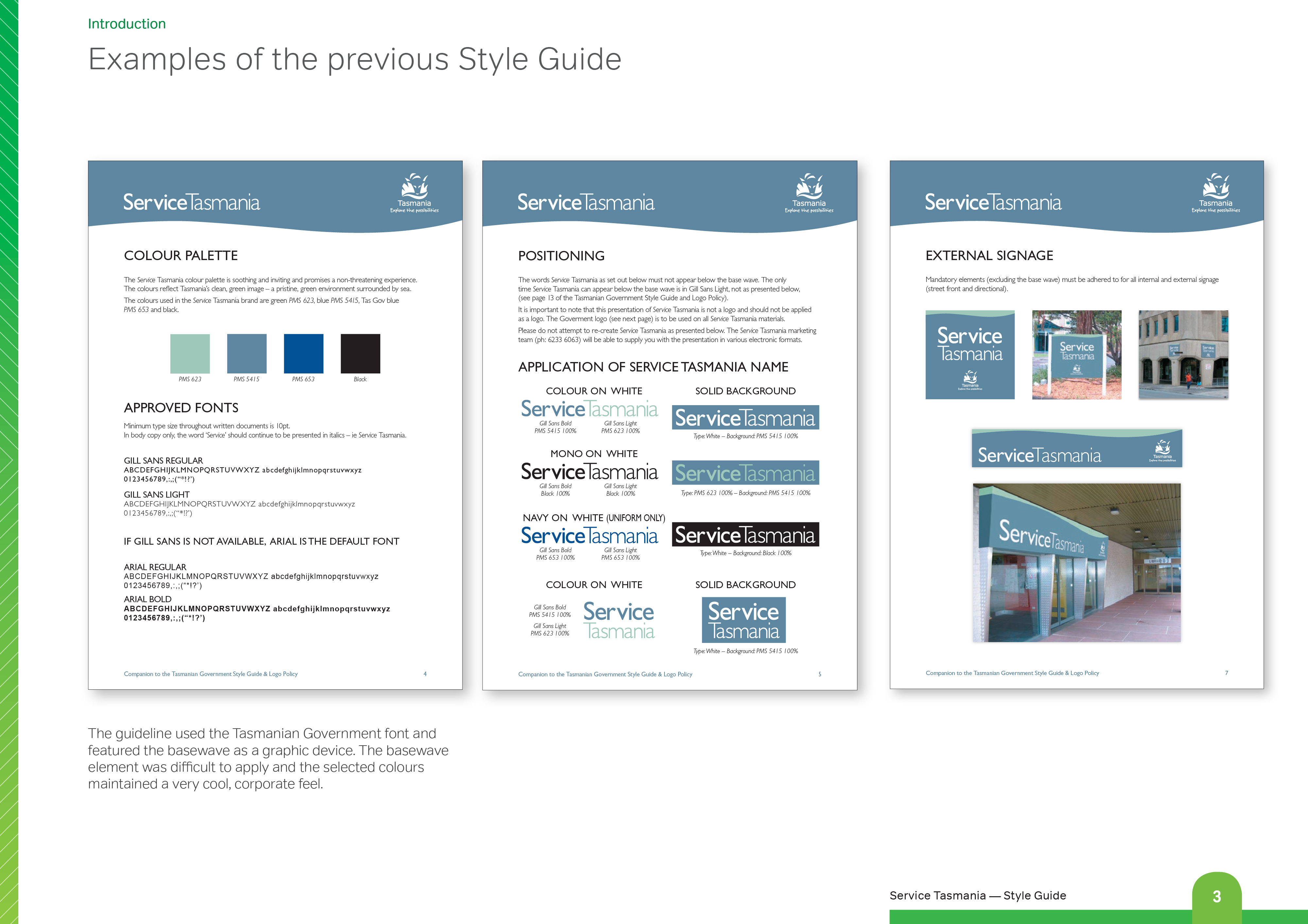
The project was set in motion when a series of centres were lined up for new fitouts. The previous identity used the standard government font, Gill Sans, a pale blue palette and a wave device echoing the state's basewave. Together it read as reserved and formal, with little presence of its own. With a service that dates from the late nineties, some centres also carried much older remnants of branding, so any new identity needed to bridge old and new sites gracefully rather than demand a costly overnight refit.
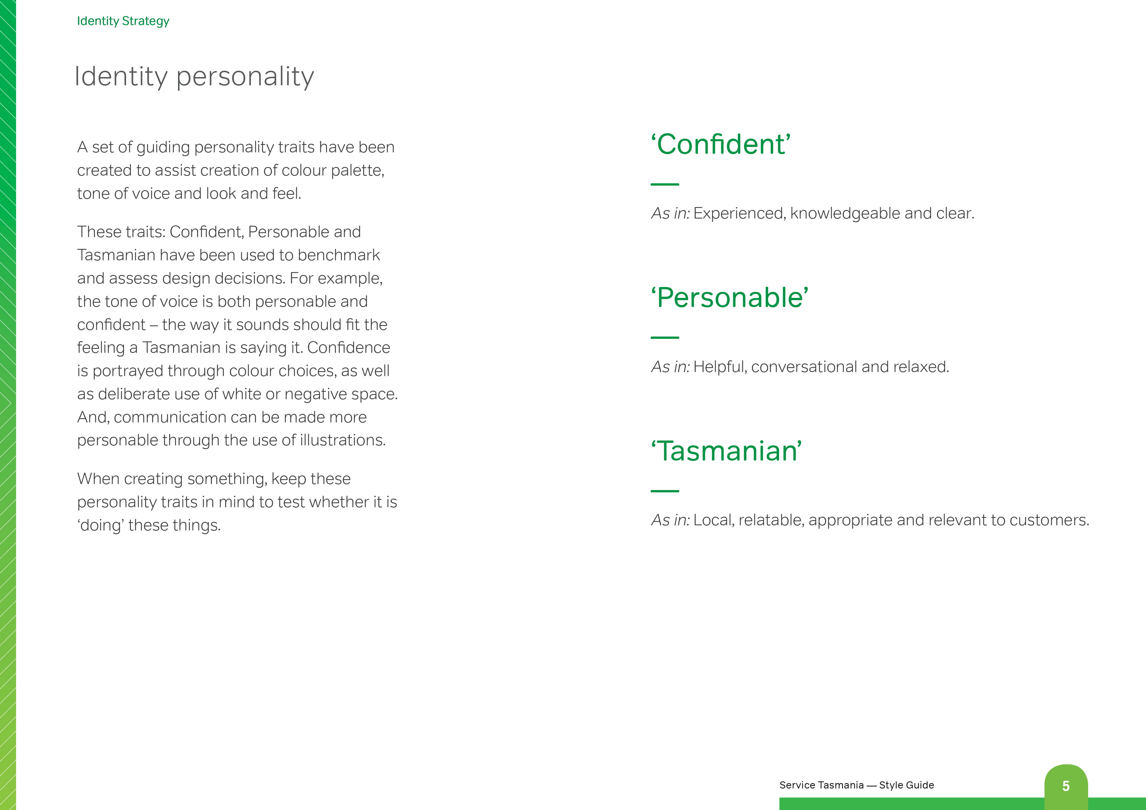
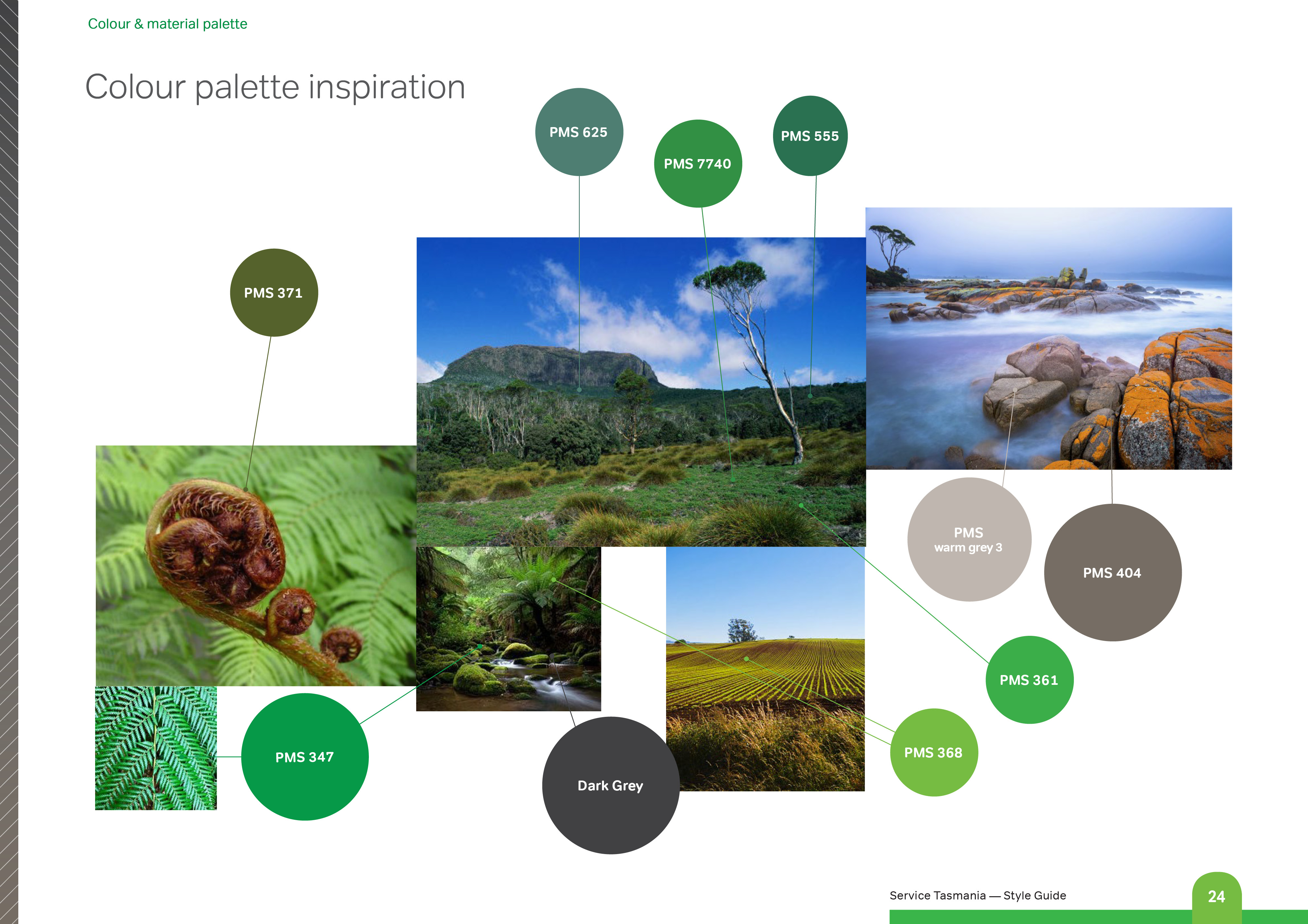
Futago worked alongside interior designers and architects on a palette that would be inviting, timeless and feel 'Tasmanian'. Three personality traits, confident, personable and Tasmanian, were used to test every decision along the way, from the shade of green on a wall to the wording on a sign.
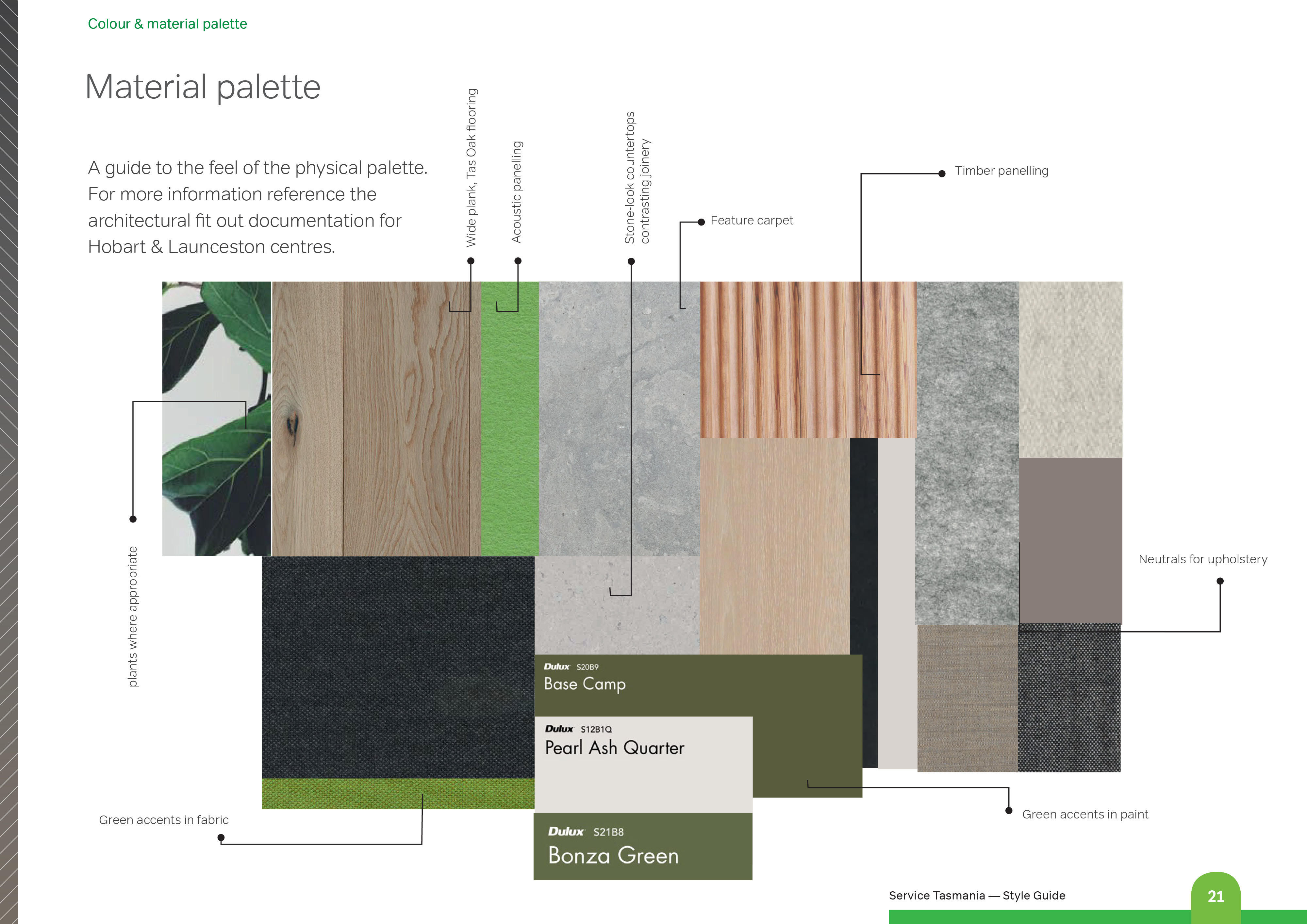
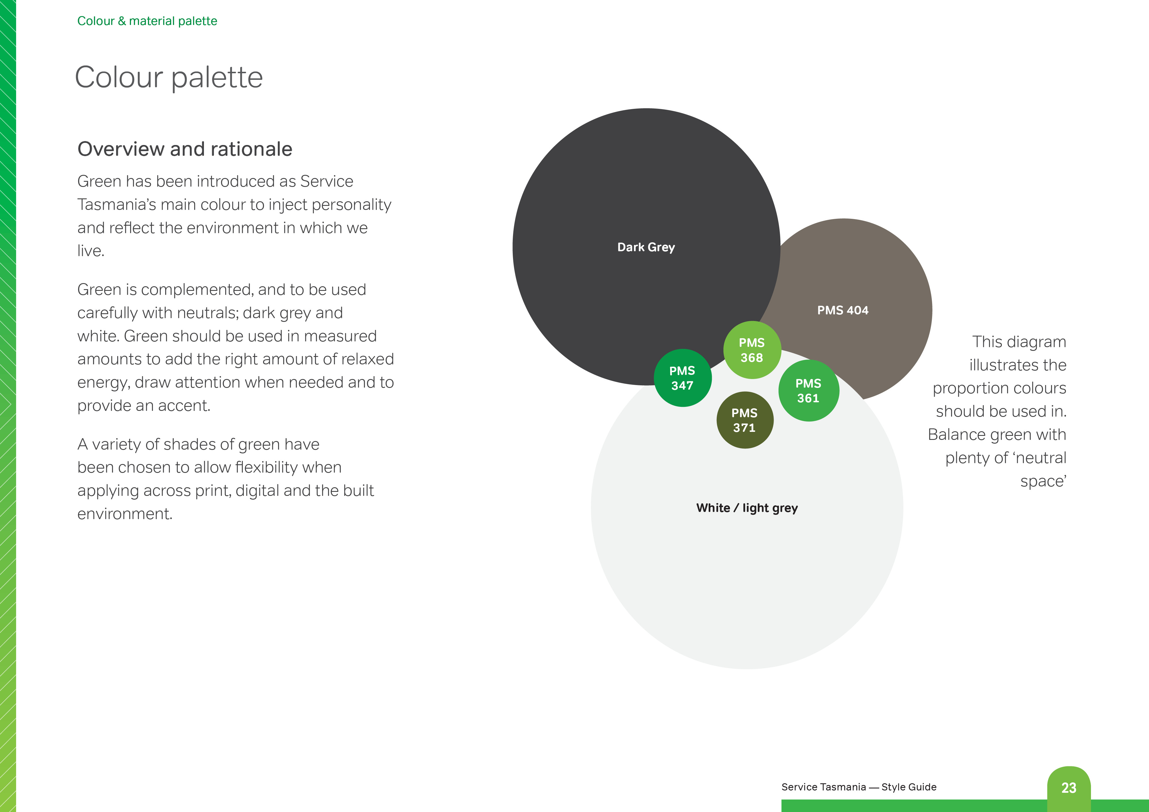
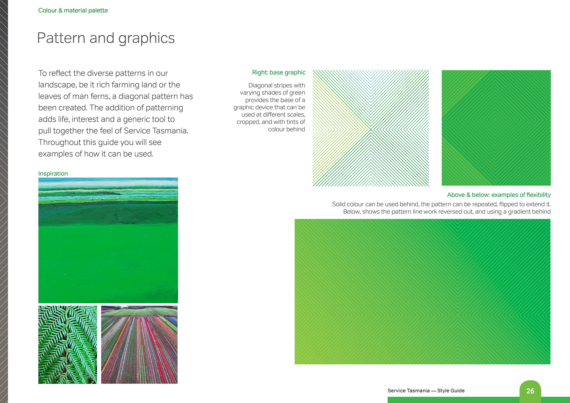
A friendlier, rounder typeface replaced Gill Sans for public-facing communication, its letterforms close enough to the original that the transition feels like an evolution rather than a break. Green was introduced as the identity's core colour, sitting alongside timber, stone and neutral tones across fitouts, signage and everyday materials. A diagonal line pattern, drawn from the rhythm of Tasmania's own landscape, fern fronds, farmland, tidal lines, became a flexible graphic device running through icons, signage and the large-scale wall graphics behind service counters.
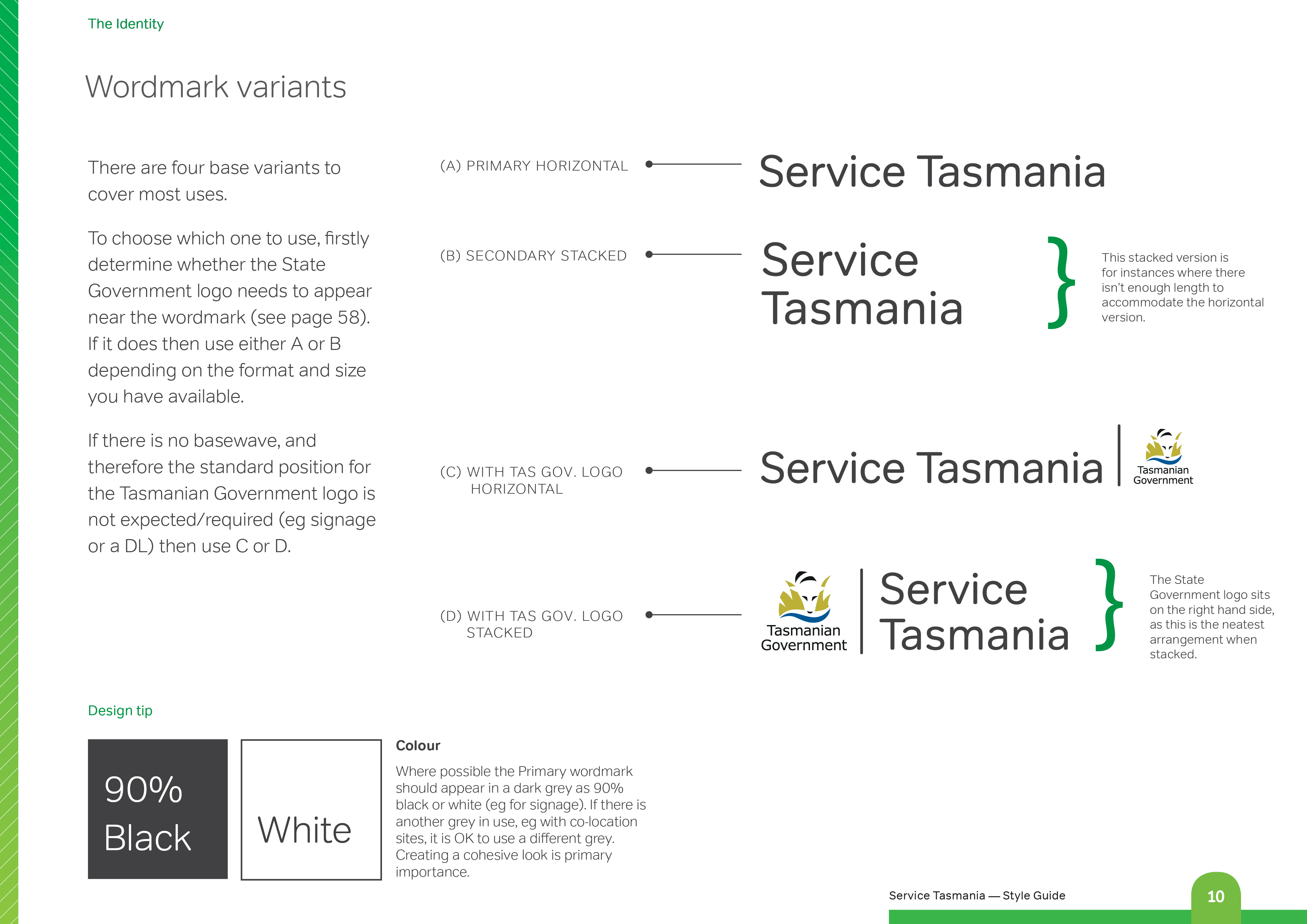
The identity consists of a suite of supporting graphics: wordmark, colour and material palette, pattern and illustration system, signage and stationery, built to roll out gradually as centres are renewed rather than all at once. It works as easily for a stand-alone shopfront as it does for a community hub shared with Libraries Tasmania or a Child and Family Centre.
Tone of voice was part of the brief too. With close to half of Tasmanians lacking the literacy and numeracy skills they need, Futago and the DPAC Communications team rewrote how Service Tasmania speaks to its customers: plain language, short sentences, written the way you'd actually say it out loud. A licence test notice that once read like a legal warning now reads like a person explaining the rules. An email that once apologised its way through three paragraphs now says thanks and gets to the point.
Across signage, stationery, digital screens and everyday interactions, the result is an identity that feels less like a government department and more like a Tasmanian shopfront: helpful, unpretentious and glad you walked in.

ChrisCrerar-7235.jpg)



ChrisCrerar-4058Small.jpg)

ChrisCrerar-7180.jpg)
ChrisCrerar-7058.jpg)
ChrisCrerar-7230.jpg)
