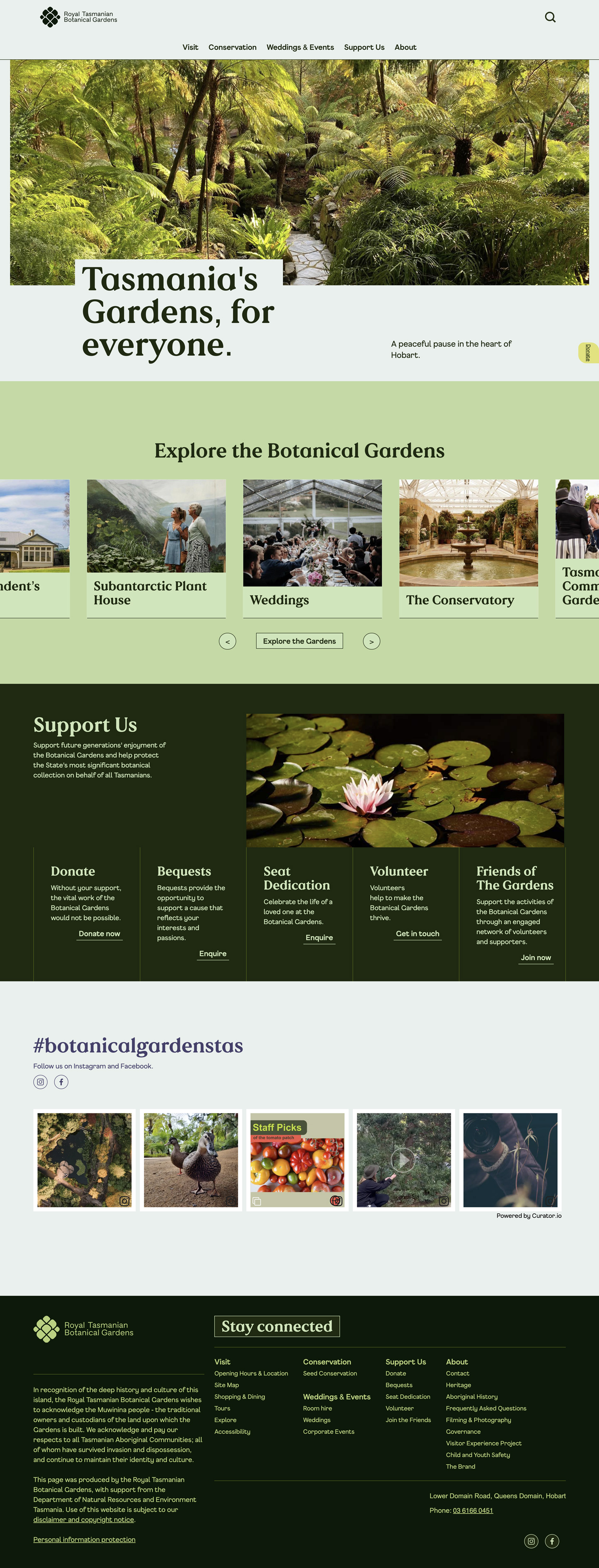
Australia’s second oldest botanic gardens came to us for a new brand as part of their 20 year strategic masterplan to improve and enhance this well-loved and iconic community asset in the heart of Hobart.
Their masterplan is built around four key pillars: place, relationships, community and conservation, prioritising projects that improve inclusivity, community involvement and the quality of the visitor experience.
Our goal for the brand was to create a sense of place that Hobartians could feel proud of and to inspire all visitors in the appreciation and protection of plants. We aimed to create something uniquely Tasmanian that would communicate with a younger and broader audience while not alienating long-time supporters of The Gardens.
Our brand strategy was built around the idea of ‘Our Gardens’ – truly Tasmanian, highly valued and connected to the community. Reminding Hobartians that The Gardens are a free and accessible local resource for learning, recreation and special events while also enhancing The Gardens reputation as a key tourist destination.
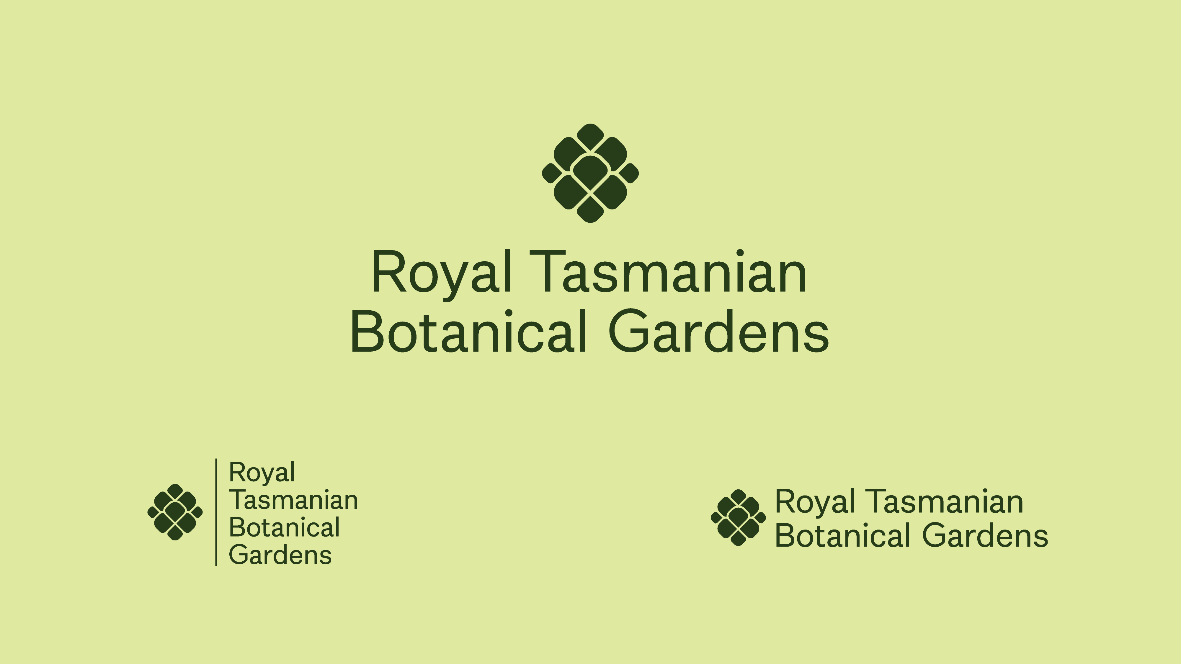
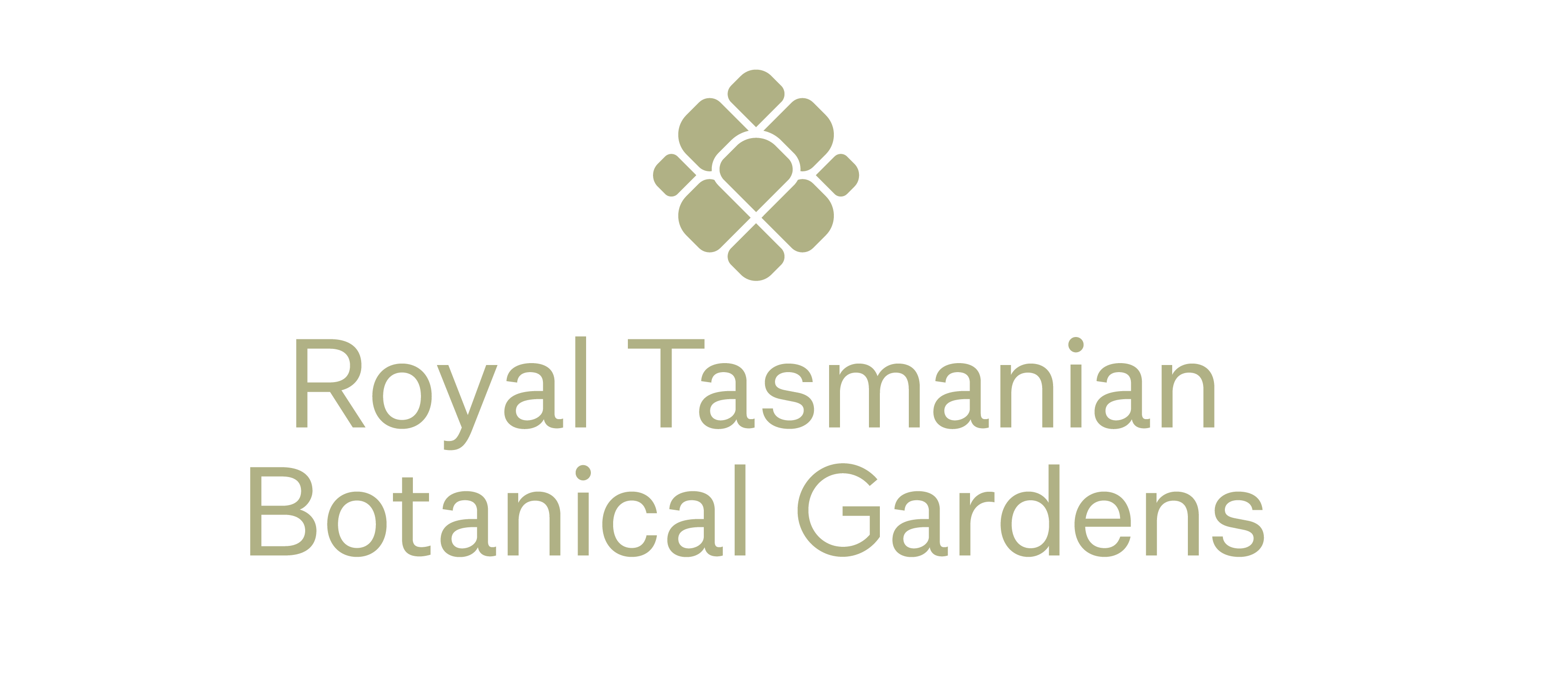
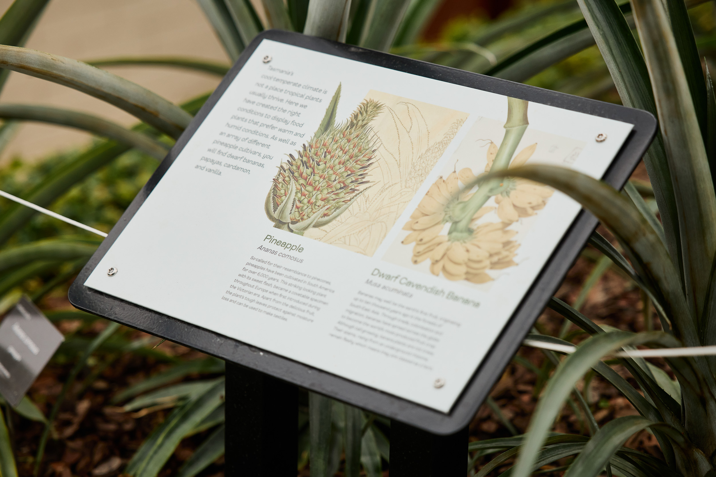
The new logo reflects the unique shapes and forms of seed pods from plant species only found in Tasmania – including Huon pine, Celery Top Pine, Strawberry Pine and Pencil Pine. The accompanying tone-of-voice is friendly and inclusive but also rich in detail, respecting The Gardens’ heritage and important place in the history and conservation of Tasmania.
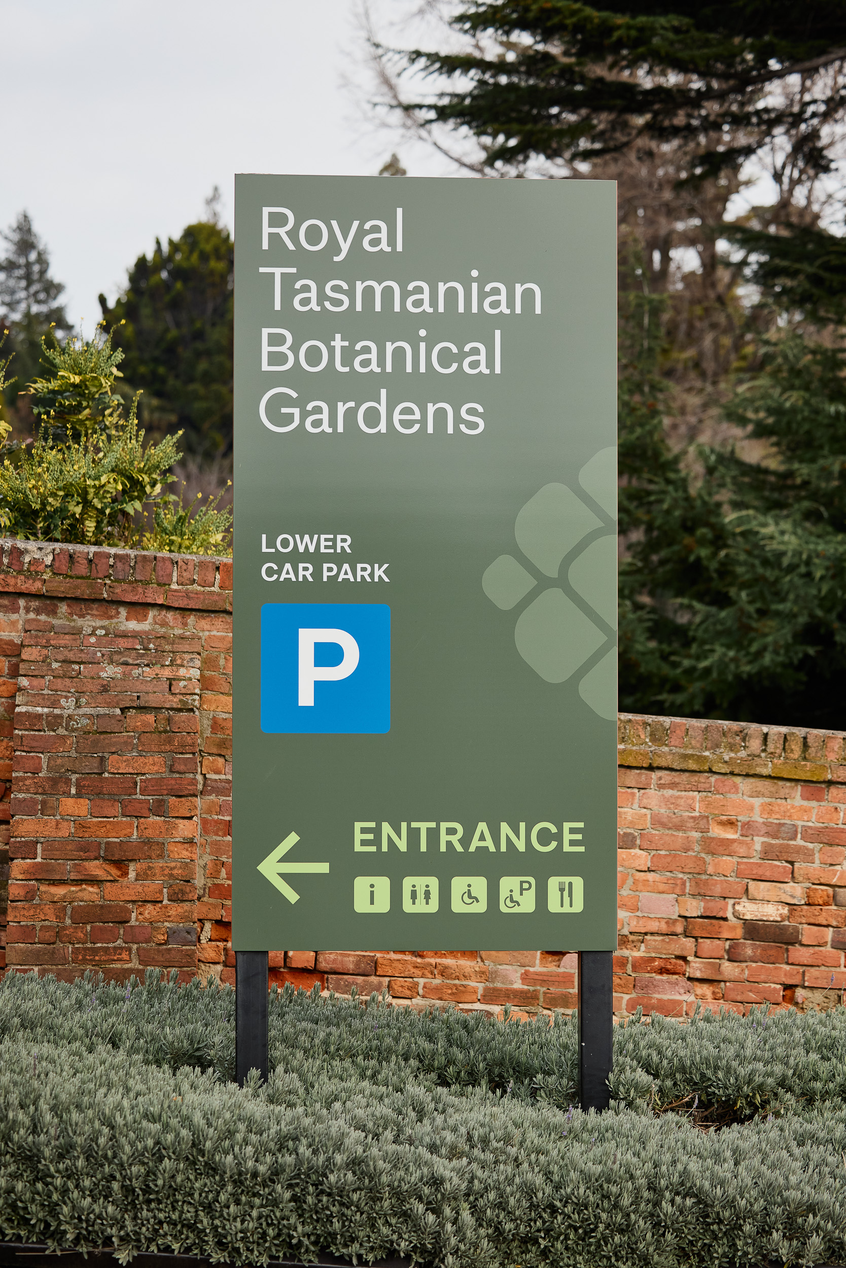
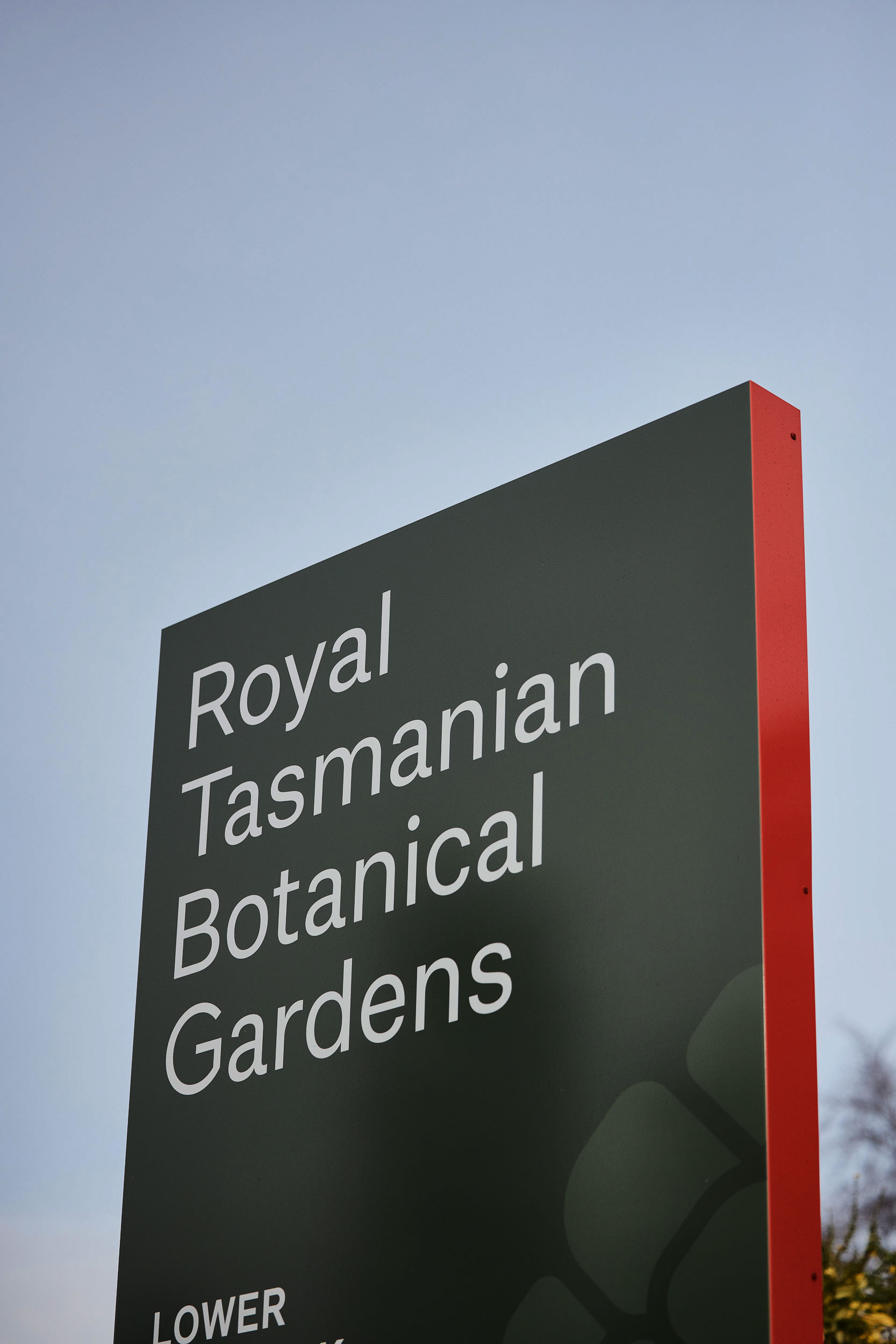
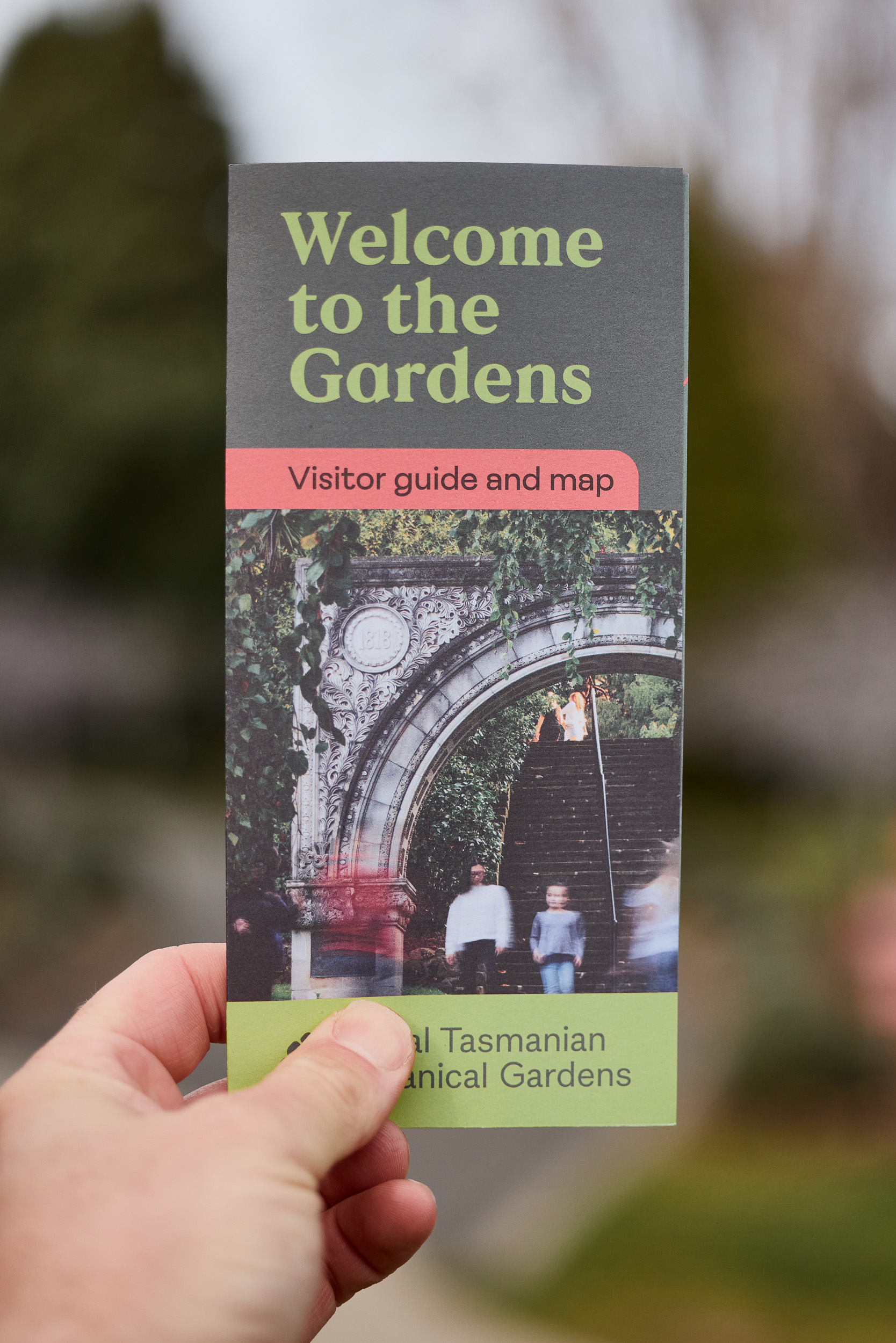
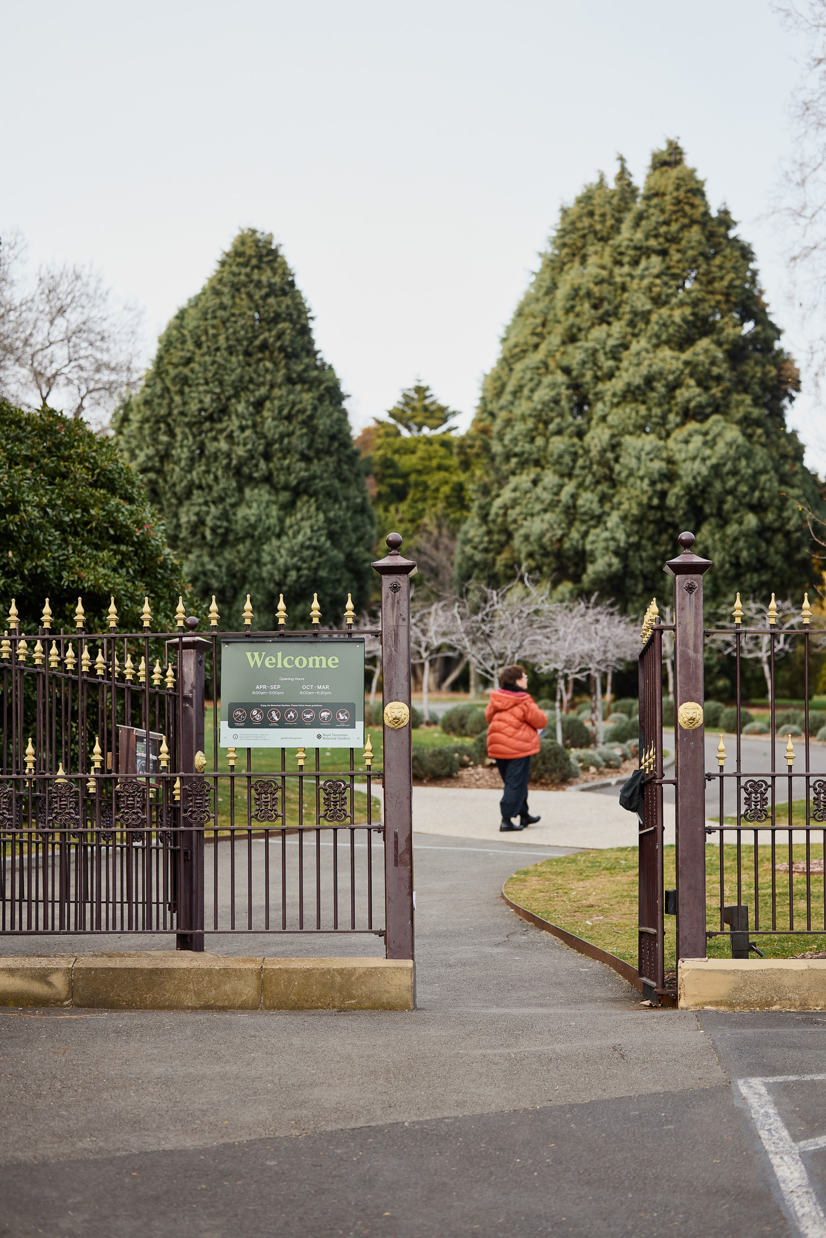
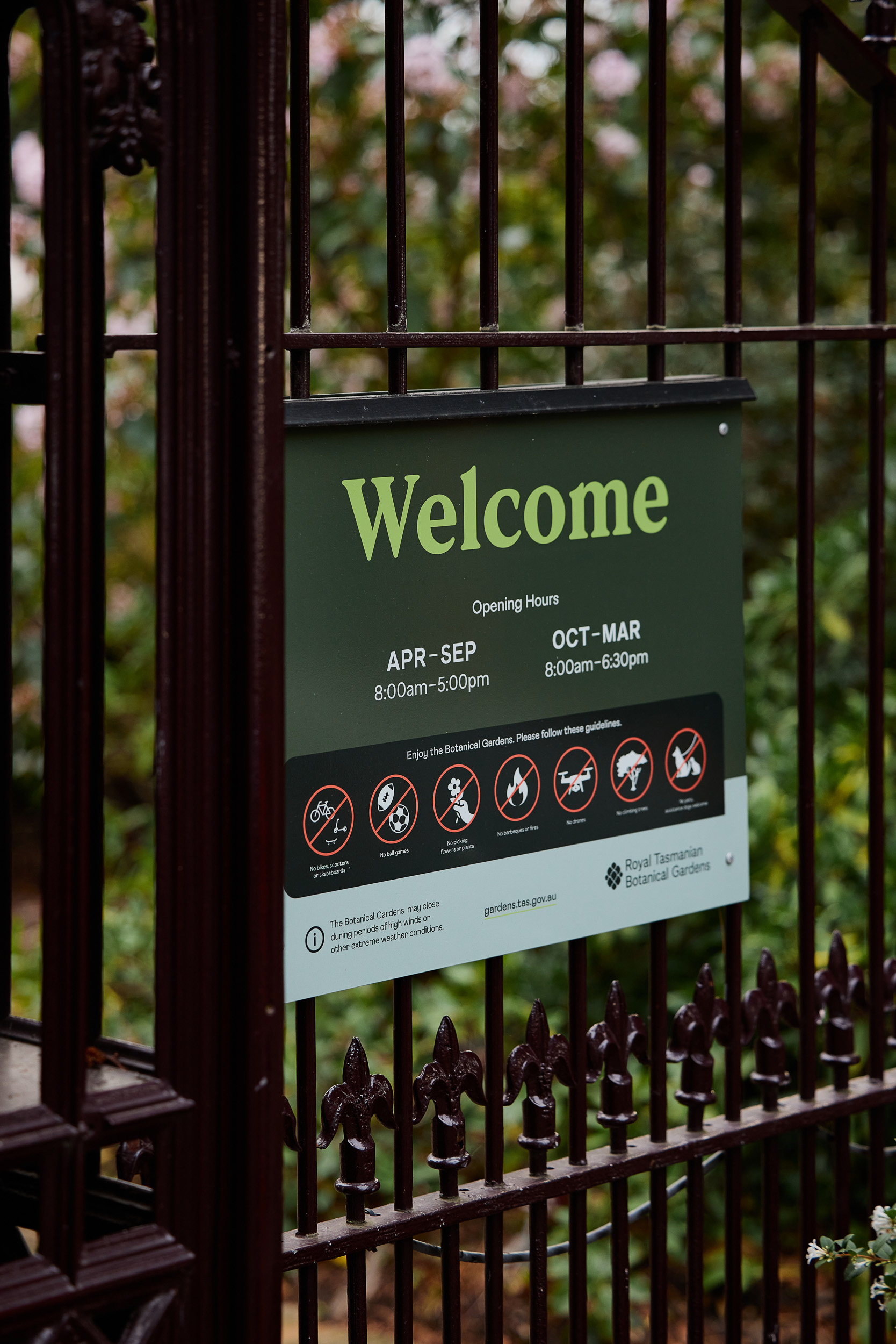
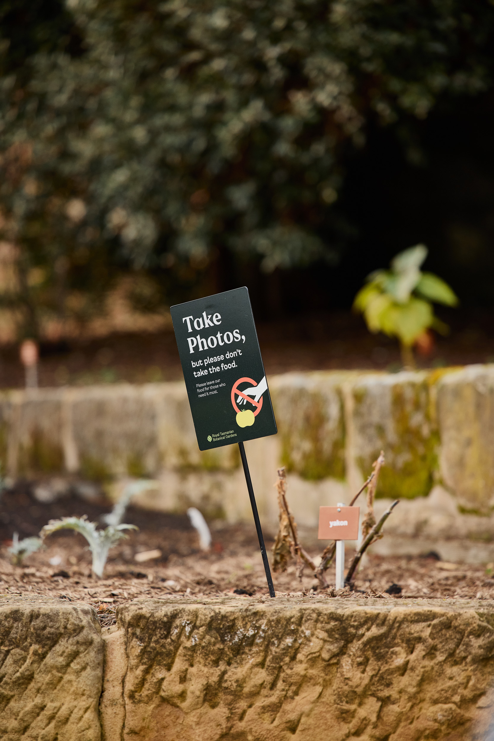
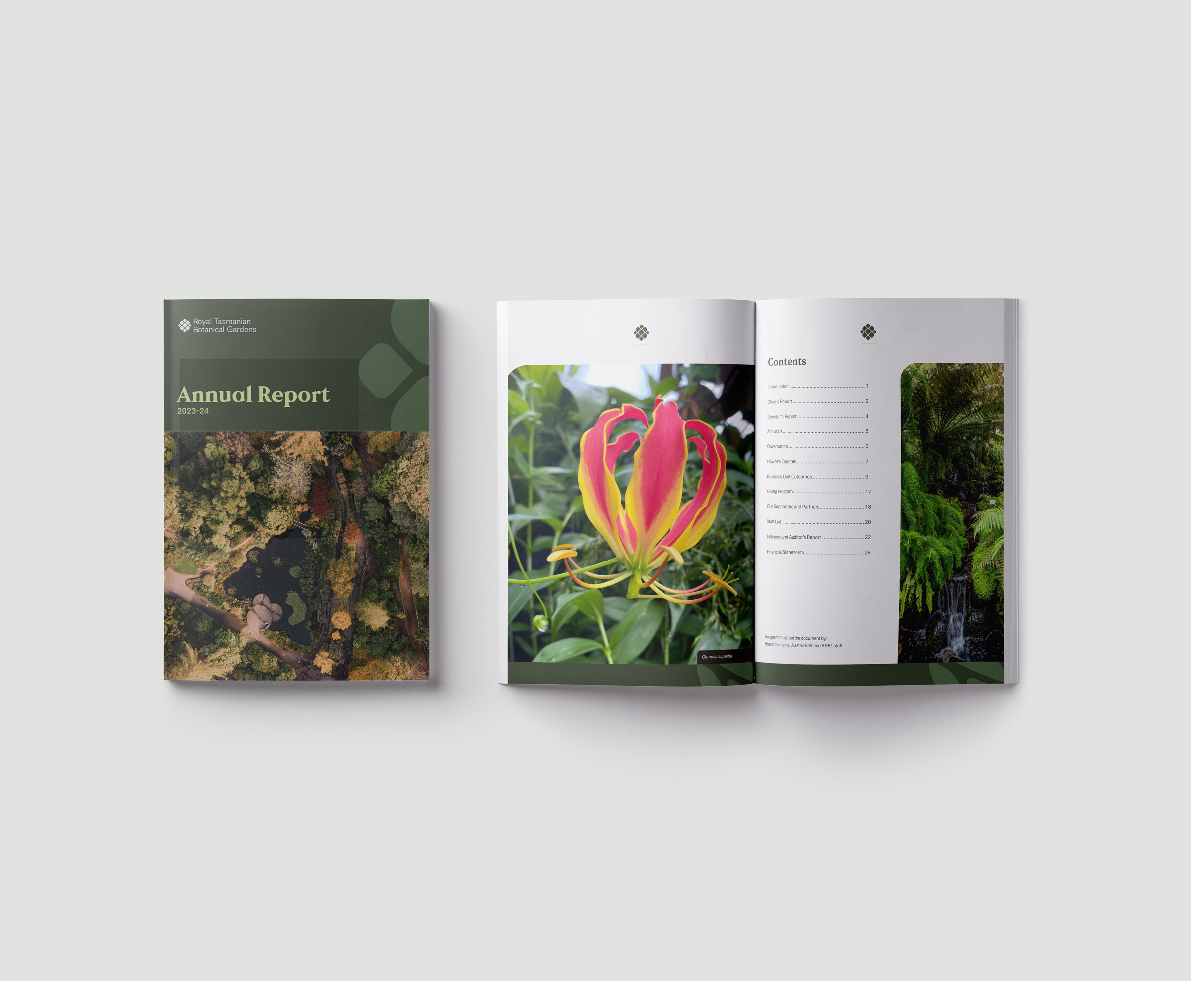
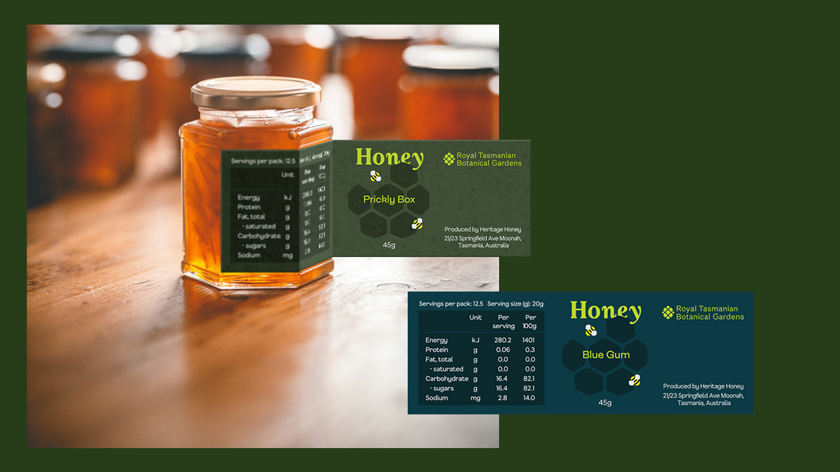
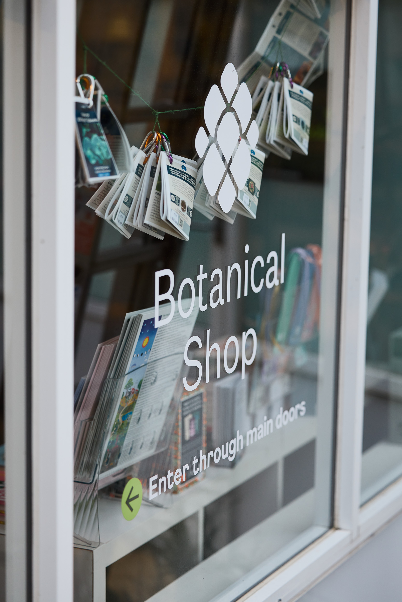
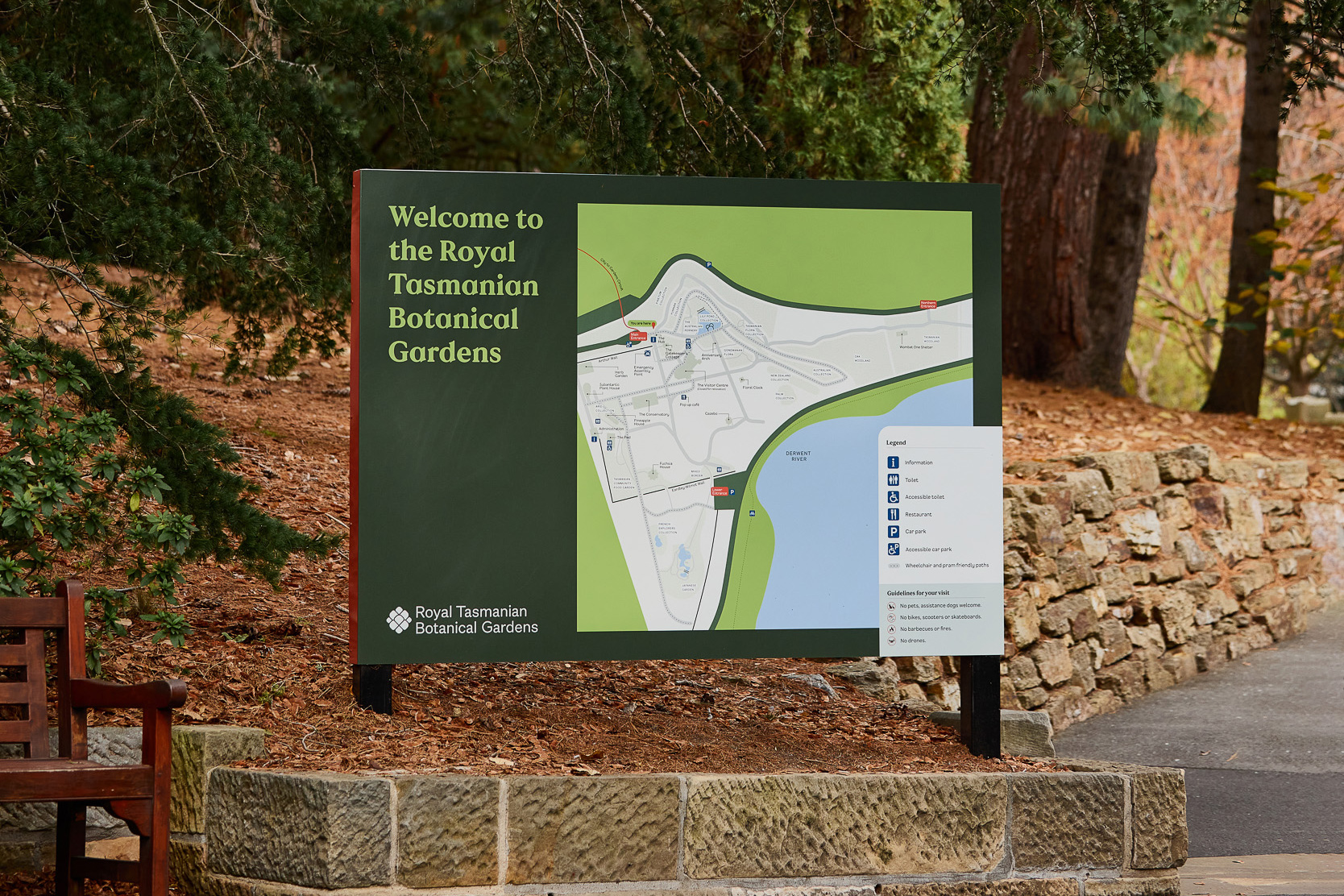
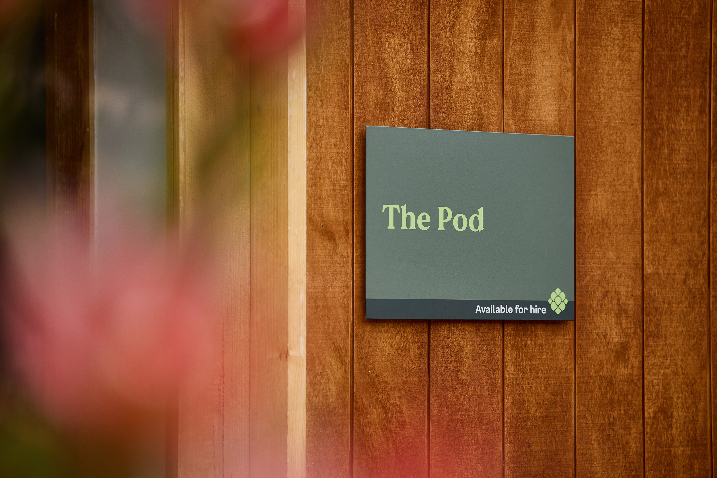
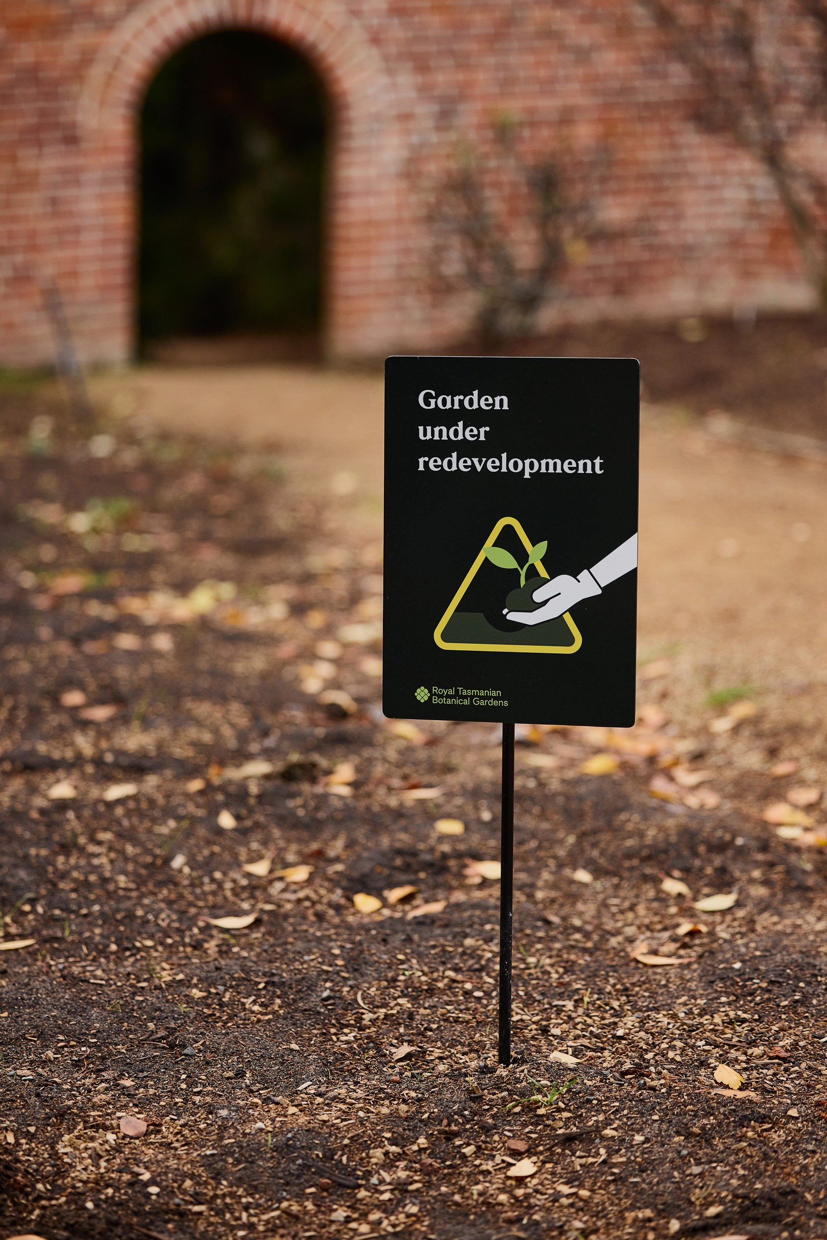
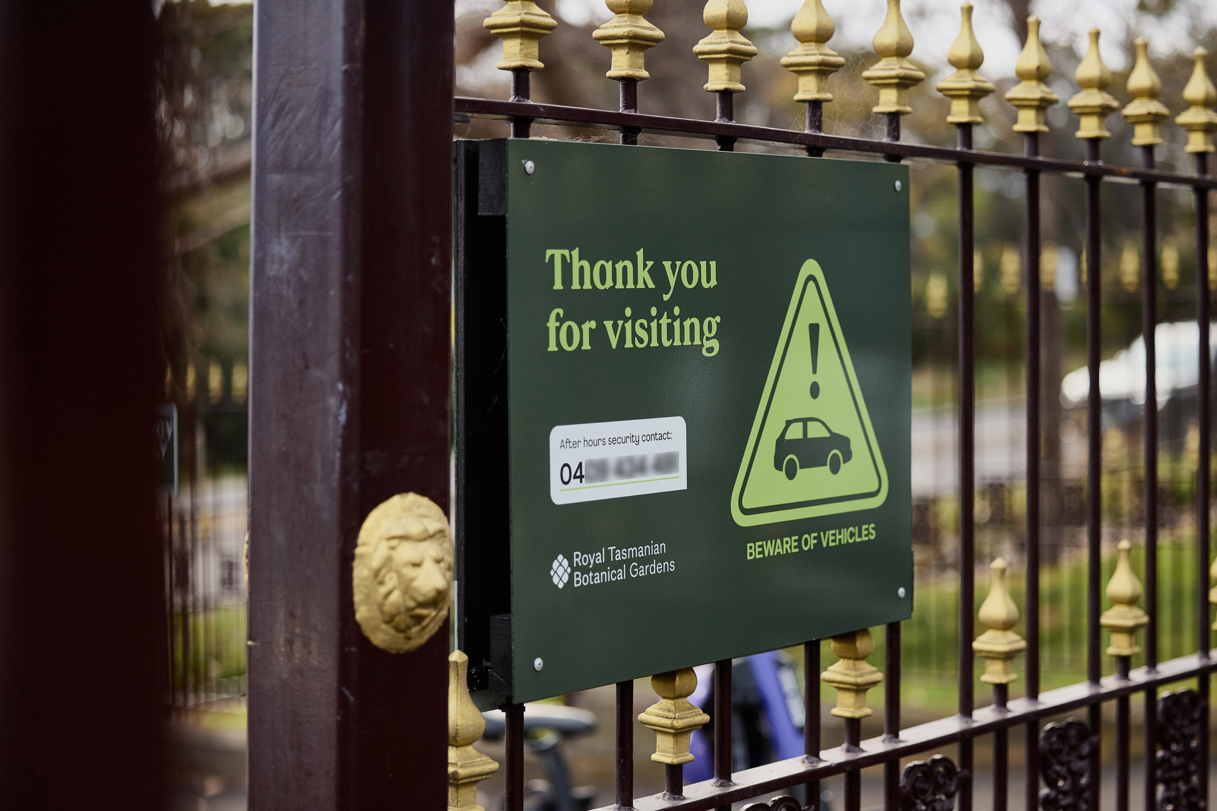
Deliverables included brand strategy and visual identity, copywriting and tone-of-voice, marketing collateral, merchandise and signage.